Skin Supply
The story of my treacherous journey elevating Citizen Supply’s competitive edge with a digital expansion: Skin Supply, a skincare microsite.
Plot Overview

Just the beginning
Status Quo
It was just a regular day— I was playing with some sticky notes, trying to save the world with my design solutions. Shasta, my cat, was by my side, purring and dreaming about the neighbor’s cat.

Call to Adventure

While Shasta and I were reading the Sunday paper, I got an alert on my beeper: an Atlanta-based marketplace, Citizen Supply, needed urgent help leveling-up their digital experience. I was tasked with expanding their digital presence by creating a skincare microsite, Skin Supply.
What is a microsite?
A microsite is an extension of a larger website, often with a URL independent of the larger website.
Assistance from the Wise
Because Citizen Supply isn’t a new company, they have already fostered a relationship with a certain type of person. At this point, Citizen Supply was the Wise one— they knew more about their typical customer than I did. To ensure I was getting accurate information, I designed and sent out an anonymous survey to people who’ve visited Citizen Supply before.

Personas
Based on the survey results, I created two personas to represent the kind of people I should focus on saving from a negative user experience. Since the survey showed that customers shop in-store and online, I broadened my sights and created a persona for both type of shoppers.


Once I had this information, I created an anti-persona. Since I was called to design a microsite, I knew I wouldn’t be focusing on people that only shop in-store. As a hero, not only do I always need an antagonist, but it also helps me spot the type of user I shouldn’t be saving.

Venturing into the Unknown
We’re not in Kansas anymore.
It was time to leave the comfort of the known world and explore the world of Citizen Supply, online and offline. My goal was to understand the company’s products, mission, and current digital experience to ensure that the microsite aligned with the existing business. After all, this story has two sides to it: the business and the user.

Okay— the business, the user, and Shasta.
Contextual Inquiry
My first stop was the Citizen Supply physical store. Nicely located in an Atlanta-based development known as Ponce City Market, which is filled with restaurants and retail stores, Citizen Supply’s store was vast and hard to miss. To blend in during my visit, I had to remove my cape, of course.

I wanted to understand the journey a typical customer would experience from the moment they stepped foot in the store to the moment they walked out with their purchase. I jotted down a few observations from my visit:
Sells a wide-range of products, from kitchenware to artwork, each made from a different local vendor
Trendy aesthetic
Caters to both men and women and a wide age-range
Products are high-quality and unique
Digital Inquiry
My second stop was the Citizen Supply online store. I thanked the UX gods and goddesses that I did not have to remove my cape for this part— that thing is hard to tie back on!
I quickly understood how much Citizen Supply values transparency between the business and the customer because of how easily I found information about them directly on their website. Here are a few of my questions I found answers to:

Key Features
I wasn’t in the clear to start saving the day quite yet. Thankfully, I wasn’t creating a brand from scratch. If I was going to create a microsite for a business that already existed, I needed to make sure it was consistent with the current brand. I took inventory of key features highlighted on Citizen Supply’s website to get an idea of their current information architecture or the organization, search, and navigation systems that help users find what they need.


Because navigation is information architecture made tangible, I paid close attention to the different modes of navigation included in the website.


Turning Foes into Friends
Was I the only one who could save the day? Skin Supply wouldn’t be the only skincare brand with handmade, sustainable, and locally-made products. I took a closer look at the digital experience of a few select competitors, or other skincare brands from which people like George or Jenn would likely purchase, to pinpoint what was done well and what wasn’t done so well. I used the mistakes and triumphs of each rival brand as inspiration, ultimately turning my foes into friends. Skin Supply would be the optimal combination of the aspects of each competitor that prove most useful to the target user, and then some.
To keep track of the features I aimed to adopt for the Skin Supply microsite, I matched each positive feature with the user need it would support.

Facing the Monster
Information Architecture
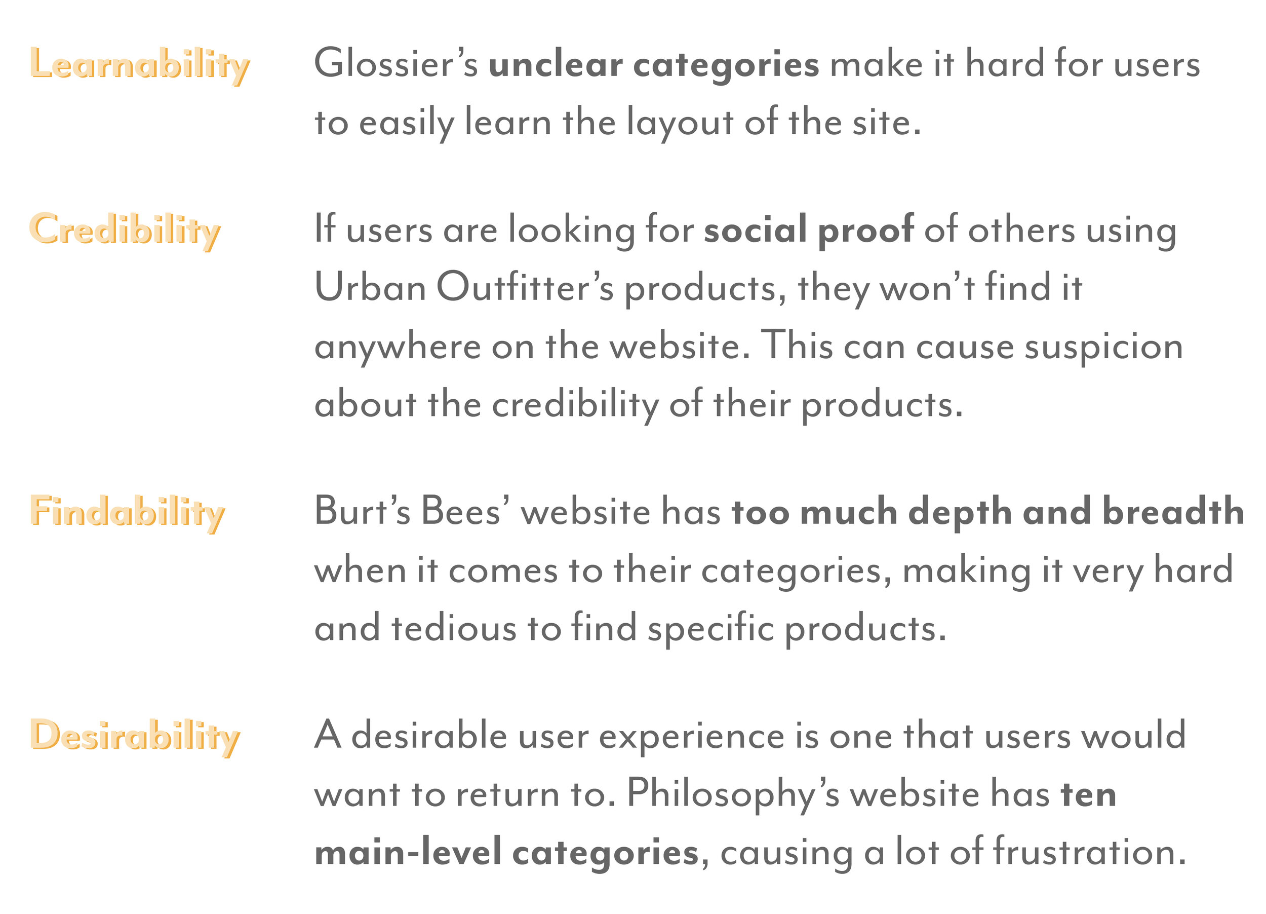
It was becoming clear to me that a major point of focus was clear information architecture. If a user like George or Jenn would like to purchase skincare products online, doing so wouldn’t be so simple. Each competitor presented issues with its information architecture and failed to meet at least one pressing need of my personas, resulting in users going face-to-face with monstrous negative digital experiences.
Information architecture is like a puzzle, from which each competitor had one or more pieces missing. What are some of these missing puzzle pieces of information architecture?


The Problem
After investigating the competition, the problem was clear as day. If George would like to purchase skincare products online for his daughter, doing so wouldn’t be so simple. Each competitor presented issues with its information architecture and failed to meet at least one of George’s most pressing needs, resulting in George going face-to-face with monstrous negative digital experiences.
On his search for skincare products for his daughter, George has been getting frustrated because he can’t easily find a good range of natural products. Because he isn’t familiar with skincare, he’s finding it hard to trust the brands enough to spend his money for these products.
Turning to the Real World
Although I had George by my side, he could only do so much for me— after all, he was just a fictional persona. So, I turned to real users. Through the open card sorting technique, I asked six users to organize a variety of 50 skincare products, which were representative of those to be included on the Skin Supply microsite, into groups and sub-groups that made sense to them and assign their own labels to these groups.

Two of my participants completing the card sorting activity.
Why card sorting?
Card sorting:
- is a research tool for information architecture
- is a flexible method to understand how others organize information
- is cheap, fast, and easy
Preparing the card deck
This wasn’t any ordinary card game we were playing. To ensure that the card sorting exercise gave me tangible and usable results, I had a few ground rules for choosing the items on my cards:

Some examples of items included in the card sorting exercise:

Pick a Card, Any Card
Open Card Sort
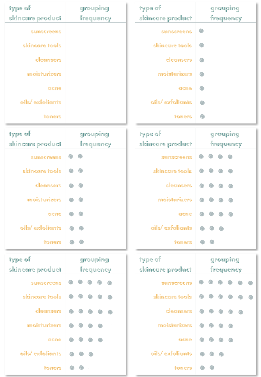
Below I summarized what people did when creating primary, top-level categories during the open card sort via a simple dot plot. I took an exploratory approach to my analysis, highlighting any trends and patterns that I found.

Dot plot of grouping frequencies: each dot represents a participant who grouped those types of skincare items together.
Here are some key takeaways of what people did when grouping the skincare items together:
More commonly used skincare products, such as sunscreens and moisturizers were the first to be grouped together
People tend to sub-group items depending on the texture of the product
People tend to sub-group skincare tools and other products depending on their purpose
Most people are not educated about the purpose of toners, which was the most disagreed upon category
Apart from the types of products that belong to each category, the names chosen for these categories are a huge part of information architecture. I summarized what category names were chosen during the open card sort via the dot plot below:

Here are some key takeaways of what people did when naming skincare categories:
People who chose the same product groups tended to choose the same categories names
All participants named sunscreen products “sunscreens”
Most participants chose the name “treatments” for products that treat problematic skin
“Oils,” “creams,” and “tools” were commonly used category names
Name choices for facial sprays, exfoliants, and types of skincare tools were inconsistent
The Majority Rules
After I took some time to analyze the data in my UX cave, I created a tentative site map to represent the information architecture of the Skin Supply microsite. My choices for top-level and sub-categories, as well as categories names, were all based on what the majority of participants did during the open card sort.

Hybrid Card Sort
It was time to take this card game a step further. I chose three more victims to participate in a hybrid card sort. During this exercise, I asked each participant to group the same 50 skincare items based on the categories chosen by the majority of participants during the open card sort, while giving them the freedom to create categories of their own. Categories that participants did not agree upon during the open card sort were left without titles, giving hybrid card sort participants the freedom to decide where they best fit.
The hybrid card sort proved most participants had the same thought process as the participants during the open card sort; however, there were a few notable choices made. Here are some key insights of what people did in each category during the hybrid card sort:

Participants still didn’t agree upon where to place toners. How might I choose the best placement for toners so that skincare novices can still easily navigate the site?
Getting a Third Opinion
Instead of arbitrarily picking a location for toners to reside on the microsite, I did some research to see where other skincare brands placed toners within their information architecture. I took inventory of the top-level categories in which toners were placed for each skincare brand.

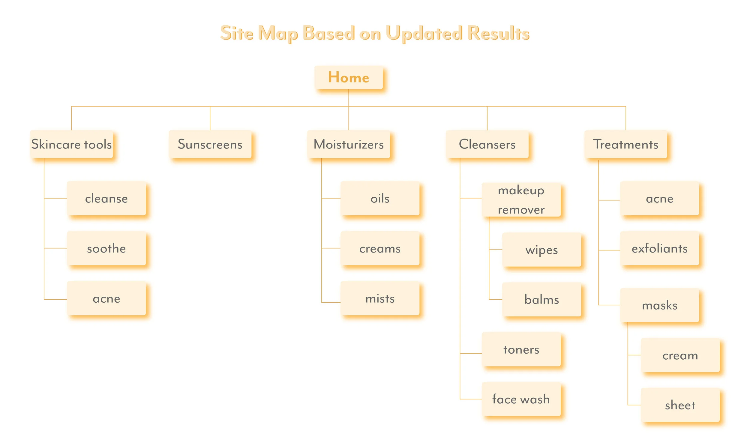
Based on my surfing of the web, most other brands think of toners as cleansers. Now that I had a happy home for every type of skincare item, I created a more finalized site map for the Skin Supply microsite.

Plan of Attack
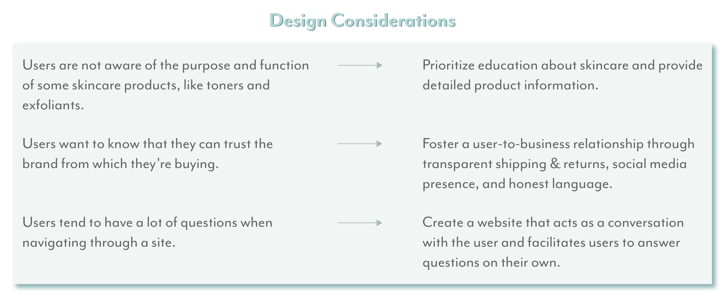
It was almost time for me to throw my cape back on, but I needed a plan to keep my eye on the target. I directly translated personas’ needs and what I learned from card sorting into design considerations to better understand how I could make the search for skincare as simple as possible.

The Solution
Skin Supply, an expansion upon Citizen Supply’s repertoire of products, will prioritize education about skincare, in-depth product details, and transparent vendor-customer relationships. Without veering away from the signature values of Citizen Supply, Skin Supply will include multiple navigation design patterns and clear information architecture, allowing novice skincare users to easily find the best skincare products, all while supporting local and sustainable businesses.
Designing My Way to Safety
Sketches
To visualize all of the information I gathered from my business research, competitive analysis, and card sorting, I put Apple Pencil to iPad and began sketching a few design solutions. I kept the design implications for George and for real-life users in mind as I sketched out every page of the microsite.

Wireframes and Design Considerations
I was starting to feel confident in my ability to fight against a bad user experience. To make my designs interactive, I created mid-fidelity wireframes. While constructing the wireframes, I made sure that my design solutions could answer the following user-centric questions.
How can Skin Supply guide users to choose the best products for their skin’s needs?
How can Skin Supply foster an honest relationship with its users?
How can Skin Supply assist users to accomplish their goals in as little steps as possible?
The Happy Path to Better Skin
If users were to have a goal in mind, like finding a new moisturizer fit for their skin type, what steps would they take to accomplish it on the Skin Supply microsite? To make sure my information architecture masterplan made sense, I create the user flow you see below:
Can Skin Supply Save Users from a Bad Digital Experience?
At this point, I had equipped Skin Supply with the most useful features possible to ease users’ search for natural skincare products. Nonetheless, a question was still on my mind: Can Skin Supply truly save users from a bad digital experience? To answer this question, I conducted a usability test with four innocent civilians who considered themselves newbies with skincare. I kept my hero identity on the down-low during testing to avoid users from getting too distracted.
The goals of usability testing included:
To evaluate the usability and learnability of the Skin Supply microsite
To iterate on any problems that prevent users from accomplishing their tasks
I carefully chose three tasks, which each user was to complete, that covered all major areas of the microsite.

Before asking users to perform the three tasks above, I gave an in-depth explanation of the purpose and steps of usability testing and background information about Citizen Supply and Skin Supply. I then gave users a chance to explore the microsite freely for a few minutes. Once users were familiar with the microsite, I had them complete one task at a time, while thinking aloud.
To evaluate the learnability of the microsite, I asked users to complete the three tasks again in the same fashion. Because users considered themselves newbies in the complex world of skincare, I didn’t expect users to immediately know which products to select; however, the Skin Supply microsite should facilitate users in easily learning how to navigate through it after their first visit.
The Skin Supply microsite proved highly usable because every user successfully completed the three tasks on their first try. Because the amount of time it took users to complete the same tasks a second time highly decreased, Skin Supply’s microsite proved to be highly learnable, too!
Returning to Safety
For any issues mentioned by the majority of users, I solved them by creating the following iterations. I grouped the issues depending on the task the user was completing when they pointed out the issue.

The Future of Skin Supply: Next Steps


A Few Things I Learned


