Pelooc
Making photography on-demand and affordable
Overview
Learning about Pelooc
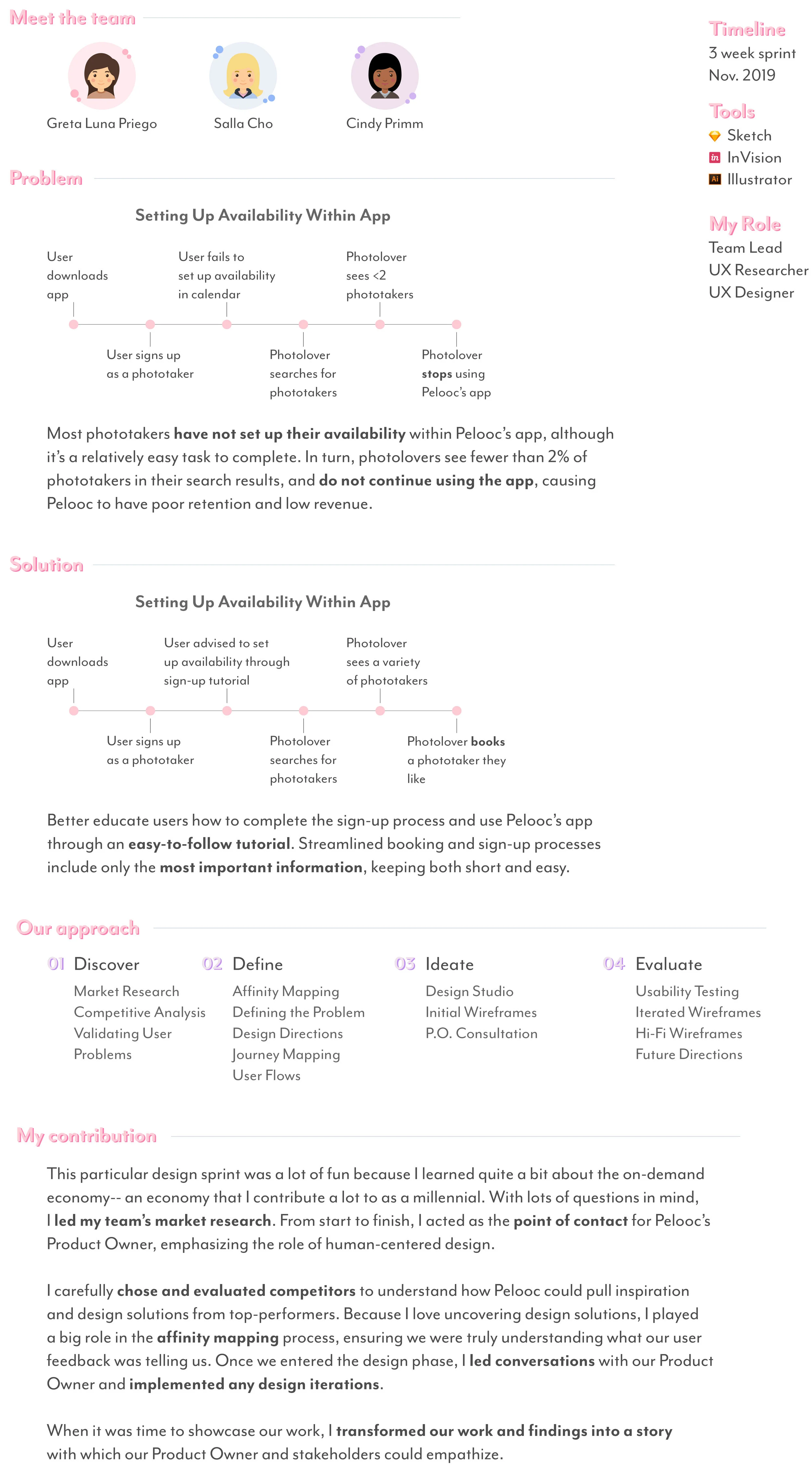
Pelooc is an on-demand photography app, where users can sign up as either a phototaker or a photolover.

What’s the challenge?
Since launching to the App Store in September 2019 and falling into the hands of real-life users, Pelooc has run into some pesky issues with their on-boarding and retention of users.

Why? For some mysterious reason, most phototakers haven’t set up their availability on their calendars within the app, making it appear as though they are “unavailable” for booking.
This wasn’t quite the vision the Product Owner had for Pelooc’s grand reveal to the world. Pelooc called on my small, but mighty, UX team to:

It was time for a team huddle.
How might we meet our client’s goals, while solving for user needs?
It’s like we were standing at the center of a five-way intersection, not sure which way to go. Before diving full force into the unknown, we decided to follow the Design Thinking Methodology, an iterative design process. This method entails problem finding and solution seeking, followed by lots of testing and refining.
Why did we choose this method?
• It encouraged us to ensure we were solving the right problems
• It encouraged us to consider several design solutions
• It emphasized user feedback and iterations
The extended list of grievances
Remember the challenge I talked about earlier? Well, that wasn’t the full story. The Product Owner later handed over a more exhaustive list of problems she identified with Pelooc backed up entirely by intuition. I knew I had to advocate for the design-thinking process and demonstrate it’s ROI in order to support our solutions with research and narrow our scope. We could foresee even more user experience issues popping up throughout usability testing of the app’s status quo.
How will we measure success?
To demonstrate the importance of research and validating Pelooc’s usability problems, I established success metrics early on with our PO and UX Team. We based our success metrics on the AARRR framework, also known as the Startup Pirate Metrics. Out of the five Key Performance Indicators included in the framework, we chose to focus primarily on the activation, revenue, and retention before and after re-design because these were the areas where the pesky problems lied.
Discovering the world of on-demand services
Before speaking with users, we established who we were designing for and why the work Pelooc was doing and thus, our work as UX designers, is important. Pelooc is a mobile app in the rapidly growing world of on-demand goods or services. As a millennial with so many possibilities for instantaneous gratification, from Uber to Door Dash, I knew re-designing the user experience for an app in this space wouldn’t be simple.
Market Research
So, what’s the big deal about the on-demand economy? More companies than ever before are shifting their focus to on-demand goods and services, resulting in consumers having higher expectations than ever of when they should receive what they want.

To blow your mind a bit, more than 22 million Americans are spending more than $55 billion each year on on-demand goods or services. Not to mention, millennials aged 18 - 34 dominate the on-demand economy. This means Pelooc is a pretty darn good idea.
“The initial phase of hype and euphoria [of the on-demand economy] is properly over and the shake-out has already begun.”
This all sounds great for Pelooc; however, “the initial phase of hype and euphoria [of the on-demand economy] is properly over and the shake-out has already begun,” according to Edison Investment Research. Start-ups based on the same idea of instantaneous satisfaction who are unable to satisfy their consumer base will be unable to keep up with the vicious competition.

Competitive Analysis
We took a peek at a few other on-demand companies’ mobile apps to see what the current market had to offer. We focused on features we knew we would be solving for Pelooc’s digital experience. Understanding what direct and indirect competitors did well and not so well would shed light on what gap in the current market Pelooc could possibly fill.

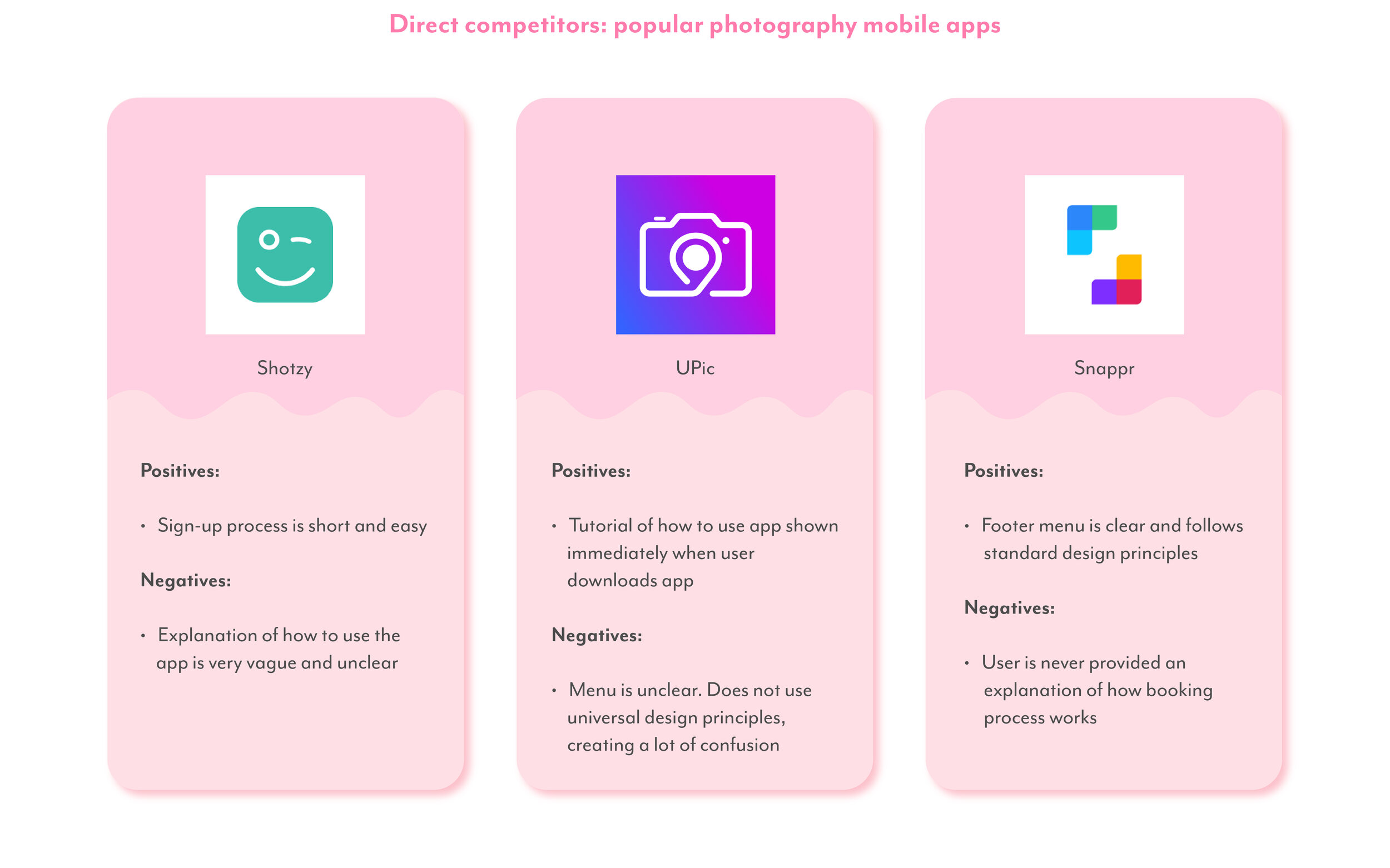

Our competitive analysis motivated us to:
Design an on-boarding tutorial that would explain Pelooc’s service
Follow standard design conventions when re-designing common features, like Pelooc’s menu
Re-design Pelooc’s booking process to be more intuitive
Simplify Pelooc’s sign-up process, otherwise possible users might be turned-off
Improve Pelooc’s notifications hub, making it more useful
Validating and testing the status-quo
Our Product Owner handed over a list of problems her users were experiencing; however, how did we know these were real problems users were facing? There was only one way to find out: usability testing of the current app. Based on market research, we asked qualified participants to complete tasks that were related to the changes our Product Owner was asking us to make.
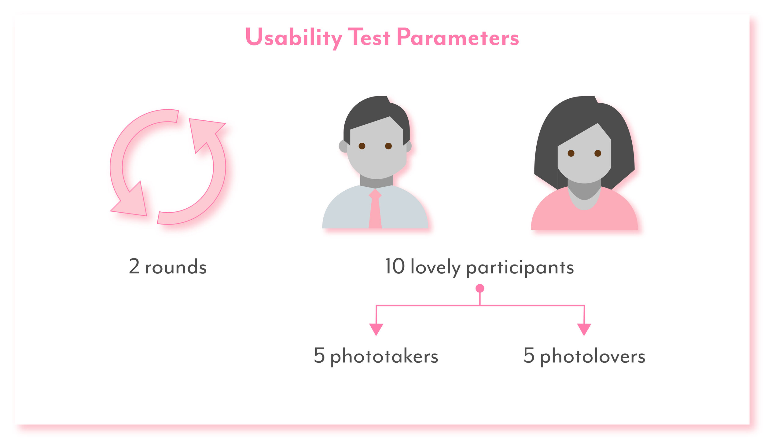
Our main findings included:
Phototakers and photolovers found the sign-up process to be confusing and frustrating.
If they got past the sign-up process, phototakers found it easy to set up availability.
Photolovers were immediately deterred by only seeing a few available phototakers.
Define
Affinity Mapping: uncovering real needs
Because of time, budget, and design principles, we couldn’t make every change requested by every user. How did we know there was enough need for each problem addressed? I led a three-part affinity mapping session, where we pinpointed which user needs were most significant.
It was looking like phototakers didn’t realize they even had to set up their availability within the app to appear in the search results and were unaware they weren’t show up in the search results. They needed better guidance.
Prioritizing based on impact
Now that we had a clear sense of the usability problems that had the biggest impact, I used the Eisenhower Decision Matrix to represent how we prioritized the initial problems our PO had presented us.
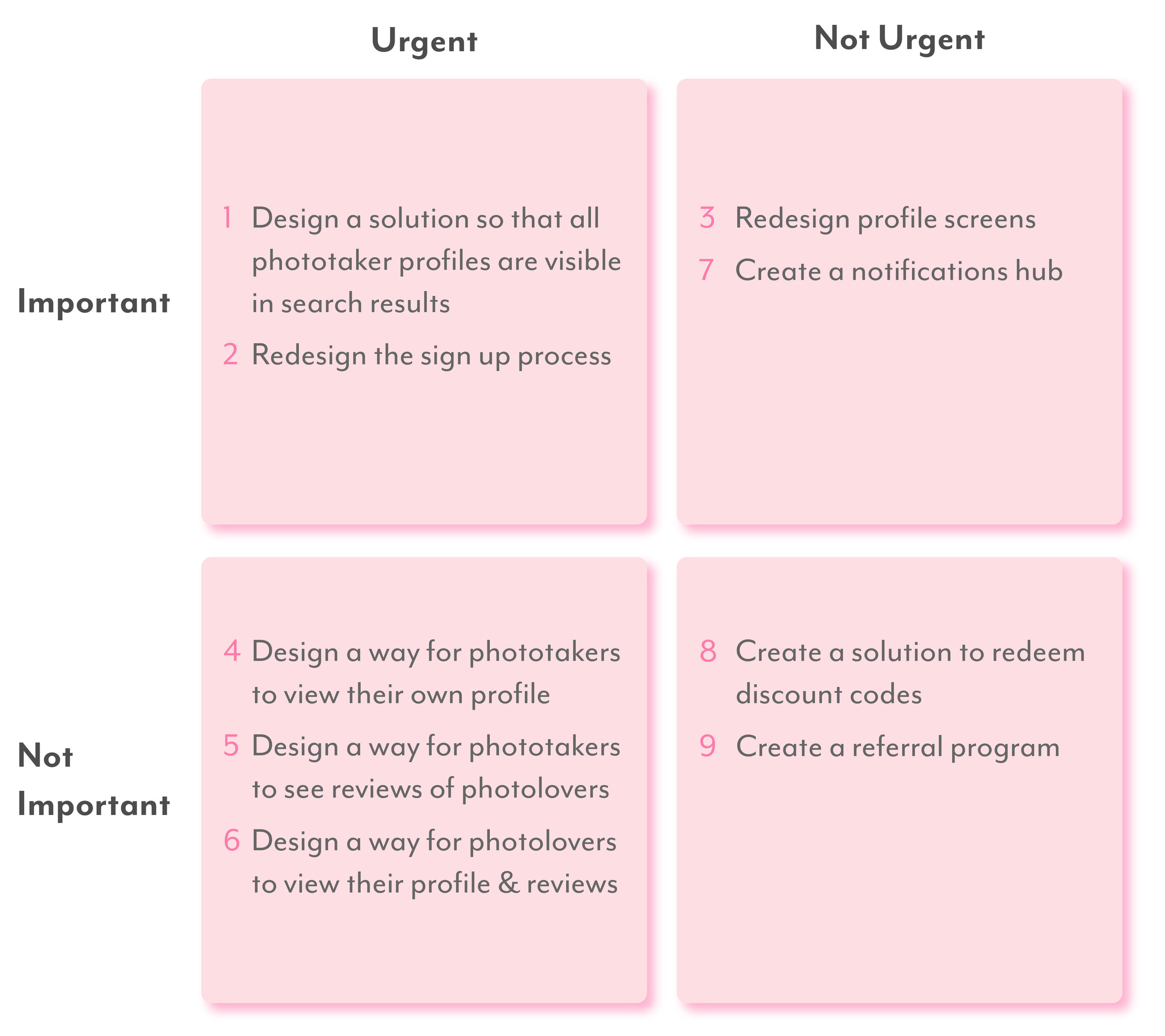
How does the Eisenhower Matrix work?
- Urgent and Important: Features that are the first impression of the app and could deter users from continuing to use the app if they cause a negative experience.
- Not Urgent and Important: Don't have to be tended to immediately, but would improve usability and user satisfaction.
- Urgent and Not Important: Should be tended to immediately. These features are what are typically present in apps like Pelooc, but they don't necessarily help users achieve their goal of booking a shoot.
- Not Urgent and Not Important: These features are more like "add ons." They aren't necessary, but might increase revenue or the number of total users. These were moved to the backlog.
Defining Pelooc’s target users
Because Pelooc has two types of users already established, the phototaker and photolover, we created a persona for each based on feedback from usability testing, market research and user-based statistics provided by our Product Owner. We detailed characteristics and design considerations for each persona.
The journey to instant photography
To better visualize the experience build empathy for both main user types trying to accomplish a task, I created the journey maps below.
Photolover’s journey with the current app
Phototaker’s journey with current app
Ideate
Design solutions for a memorable user experience
We had done all of the back-end work at this point, but it was time to get our hands dirty. We attacked each usability problem first through a good ol’ design studio, followed by more defined wireframes that better communicated our design solutions to our P.O.
Referring back to the Eisenhower Matrix I showed you earlier, we first focused on issues that were urgent and important, meaning these were the first impression of the app and could immediately deter users from exploring the app further. We then worked our way down the list of priorities.
Once my team and I implemented all necessary changes, my team member and I ran through these changes with our Product Owner. As anticipated, our Product Owner had some questions and insights.
The main concern was that photolovers might get turned off by seeing phototakers labeled as “unavailable.” Other issues were also discussed in detail.

My team member, Cindy, and I discussing possible design iterations with our Product Owner (left).
Re-redesign
Between our affinity mapping and consultations with our Product Owner, we went back to the basics and created some design sketches of possible iterations. We took this opportunity to include additional user insights that were brought up during usability testing, but weren’t able to be included in our first round of wireframes. Below are the re-redesigned wireframes.

Evaluate
Validating our design solutions
We had made it pretty far, but we couldn’t get too excited yet. Just as we validated our Product Owner’s list of usability problems, we had to validate the design solutions we created for those problems.

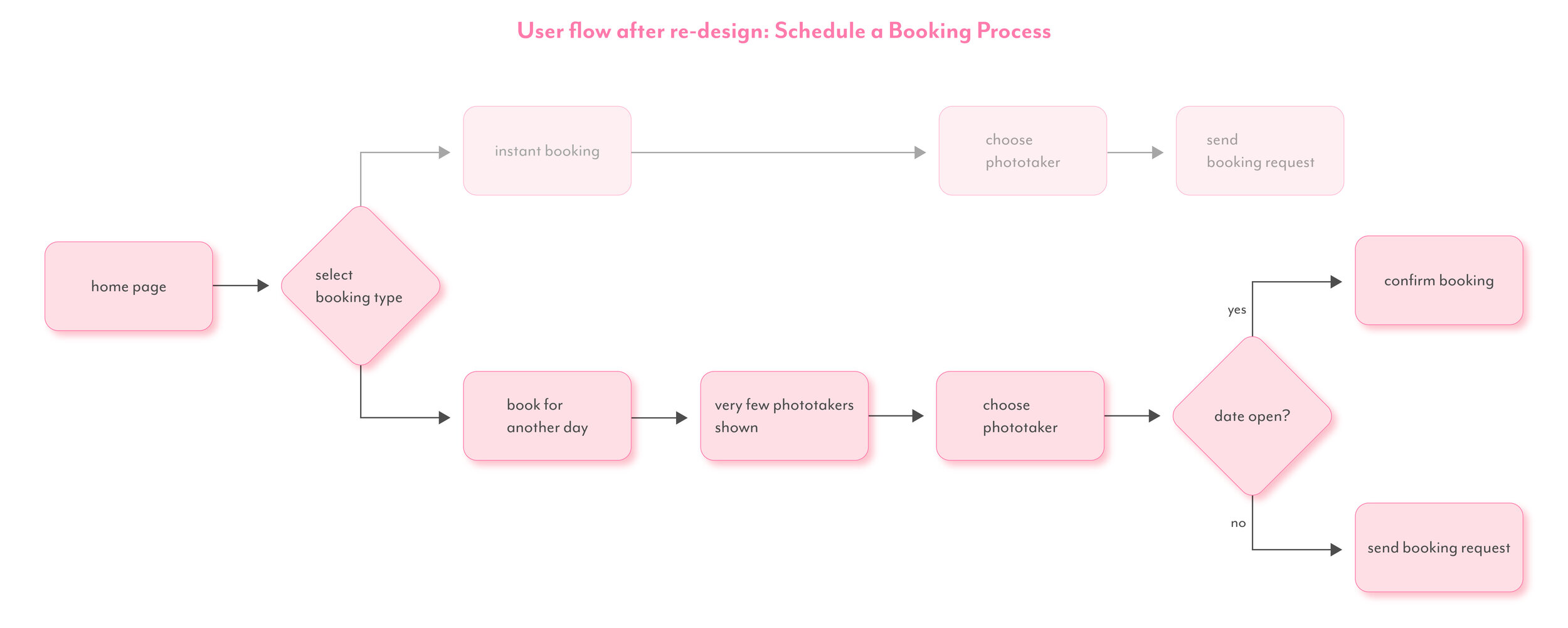
Cleaning up Pelooc’s information architecture
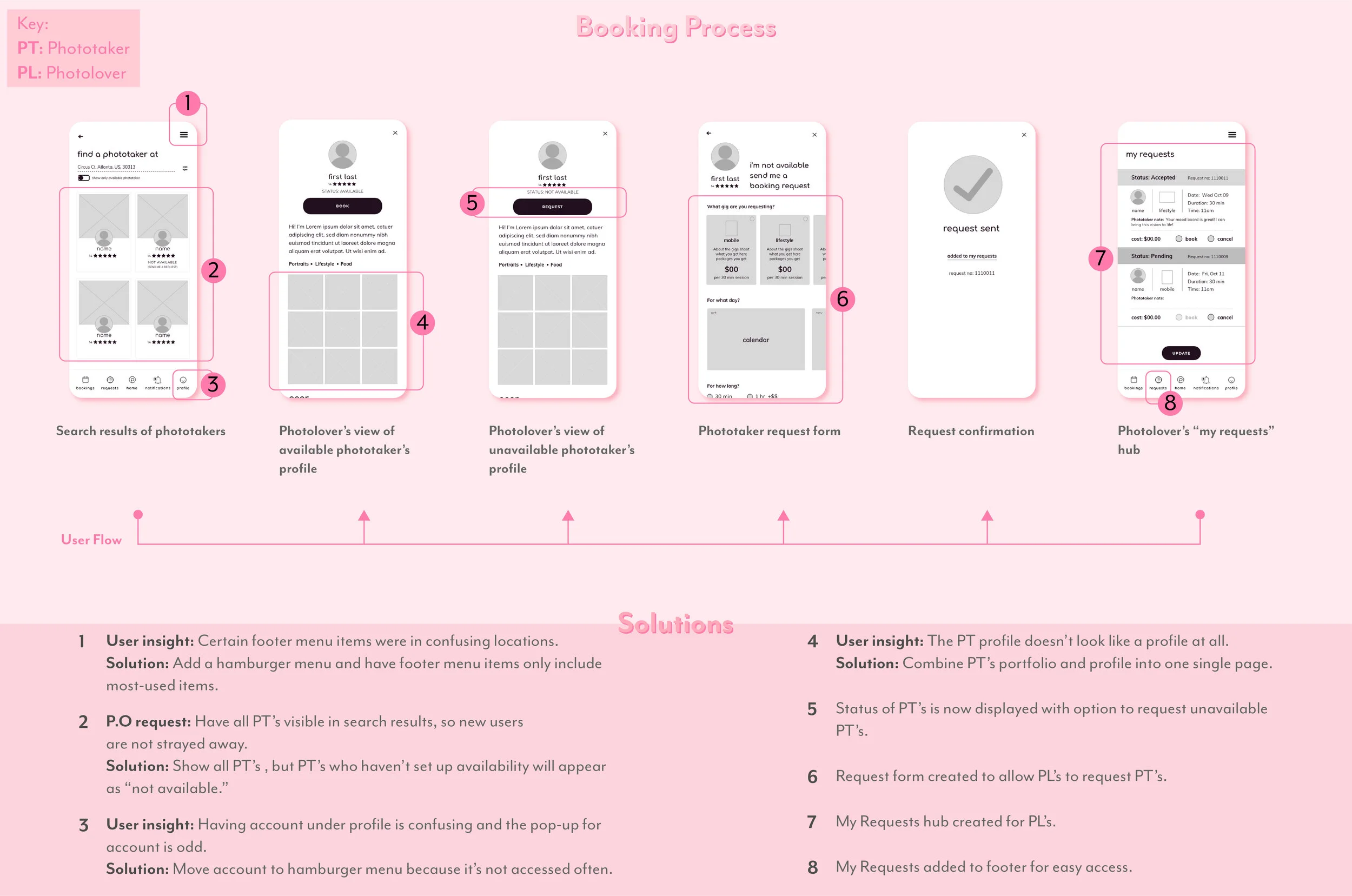
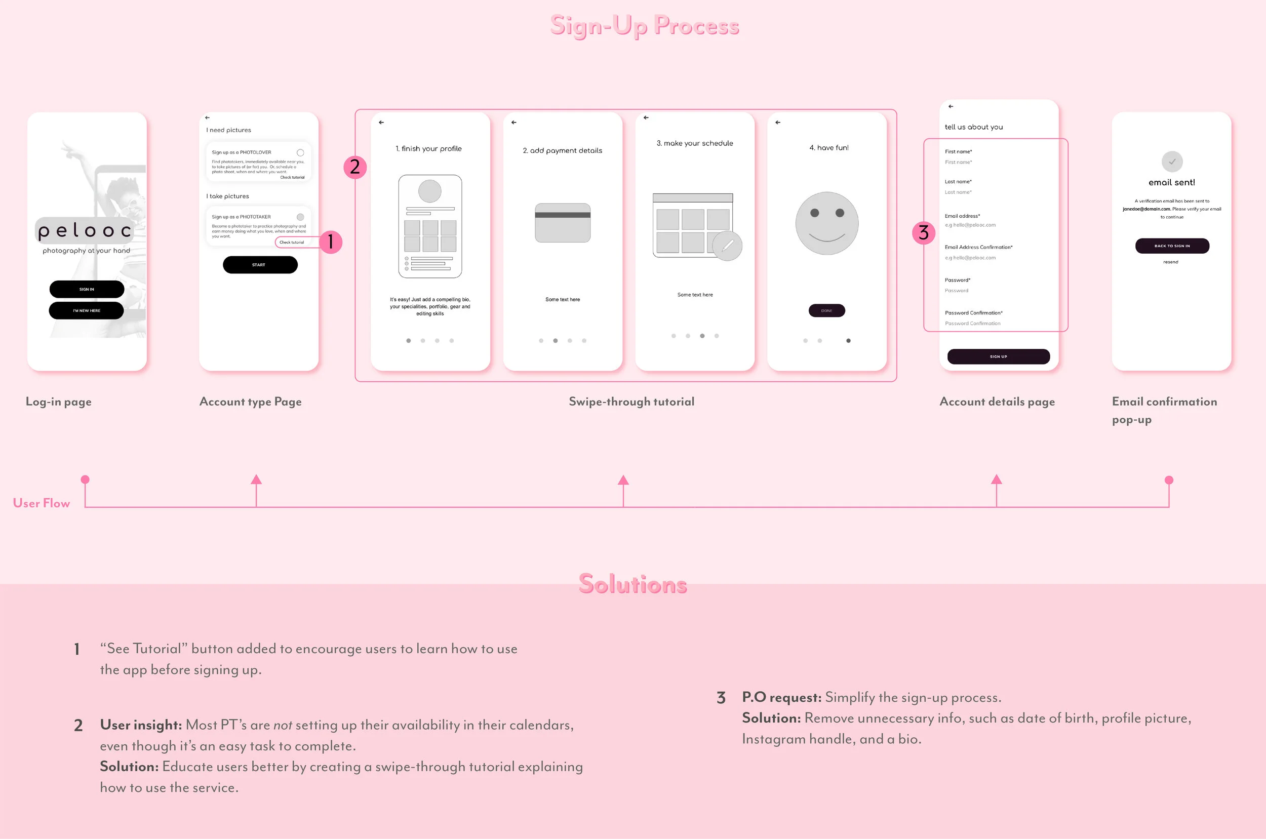
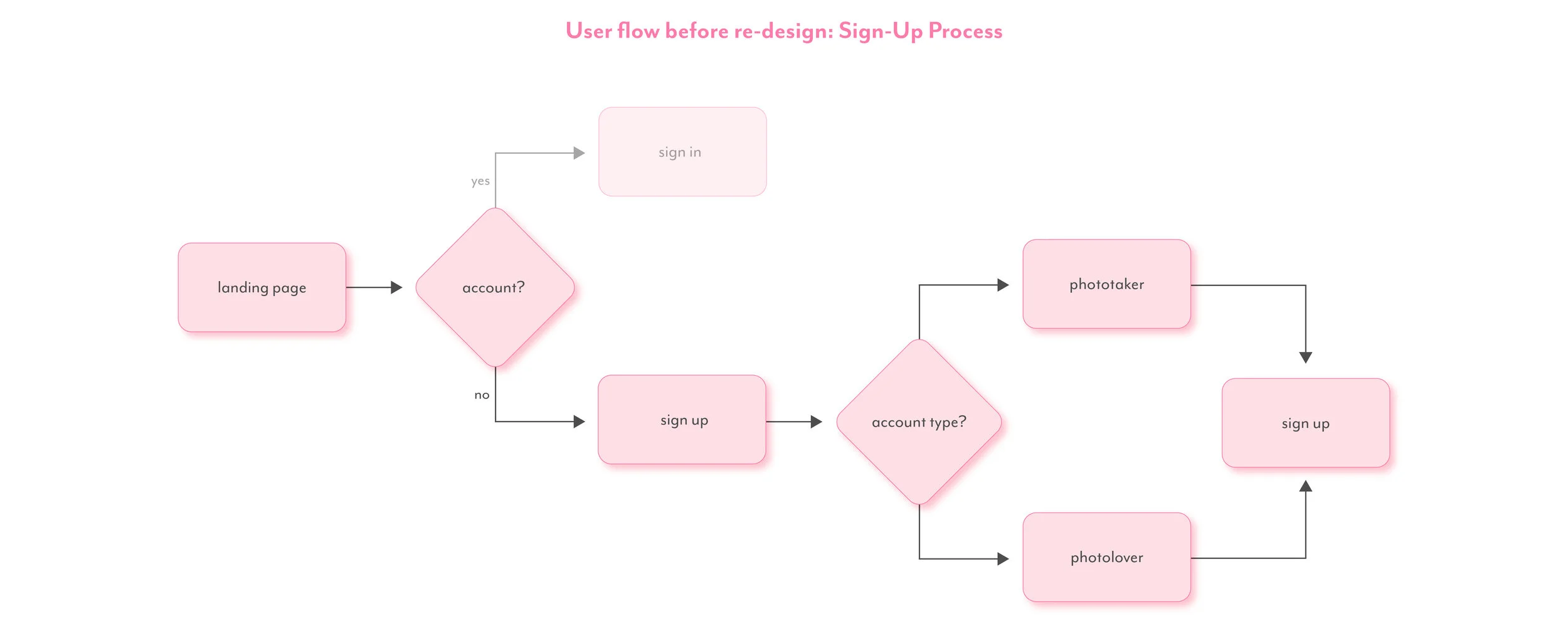
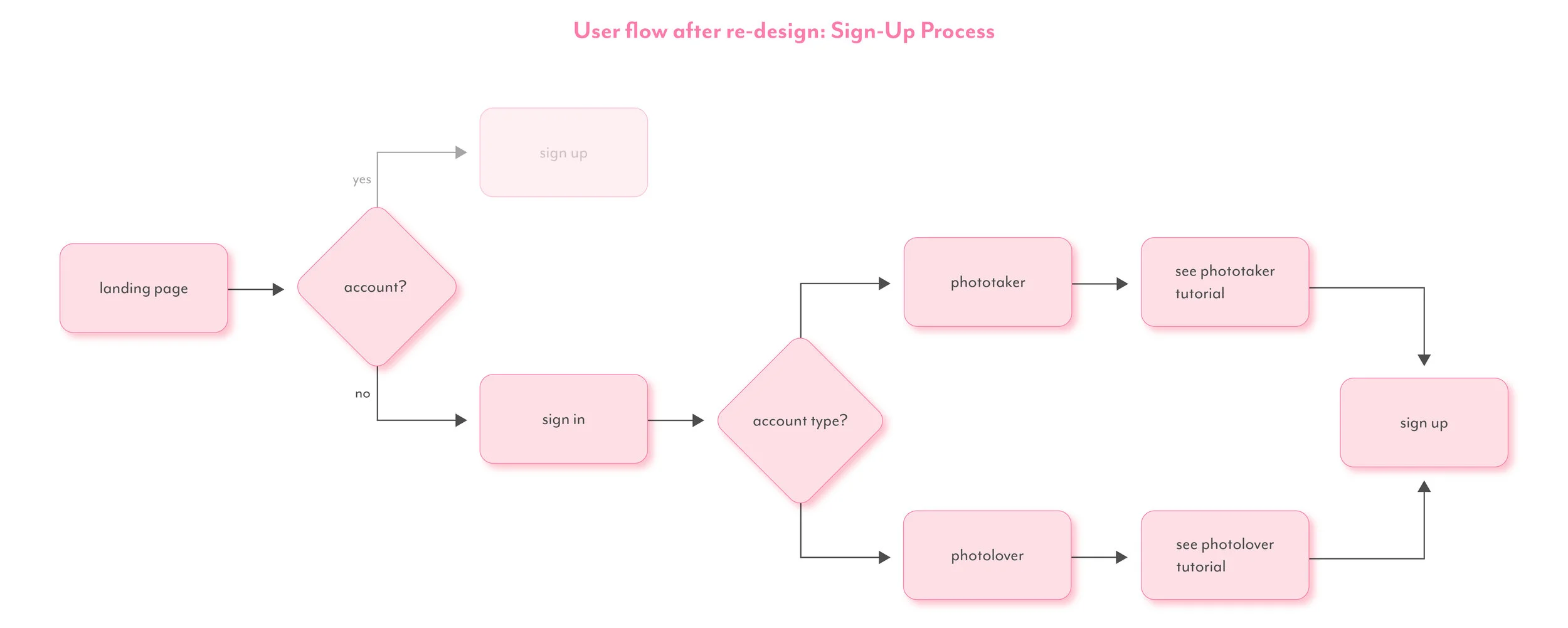
When the app was first released back in September, the information architecture was messy: users didn’t know why some things were pop-ups, where to find different pages, and why the menu was the way it was. Through our testing and iterations, we were able to re-organize Pelooc’s information architecture. This cleaning up resulted in users accomplishing goals faster (and in a happier mood). See the before and after through the user flows below:

Let’s hear it for the M.V.P: high-fidelity wireframes
At this stage, we had met all of Pelooc users’ most-pressing needs. Take a look at the design considerations implemented in the high-fidelity wireframes below:


Backlog items: future steps
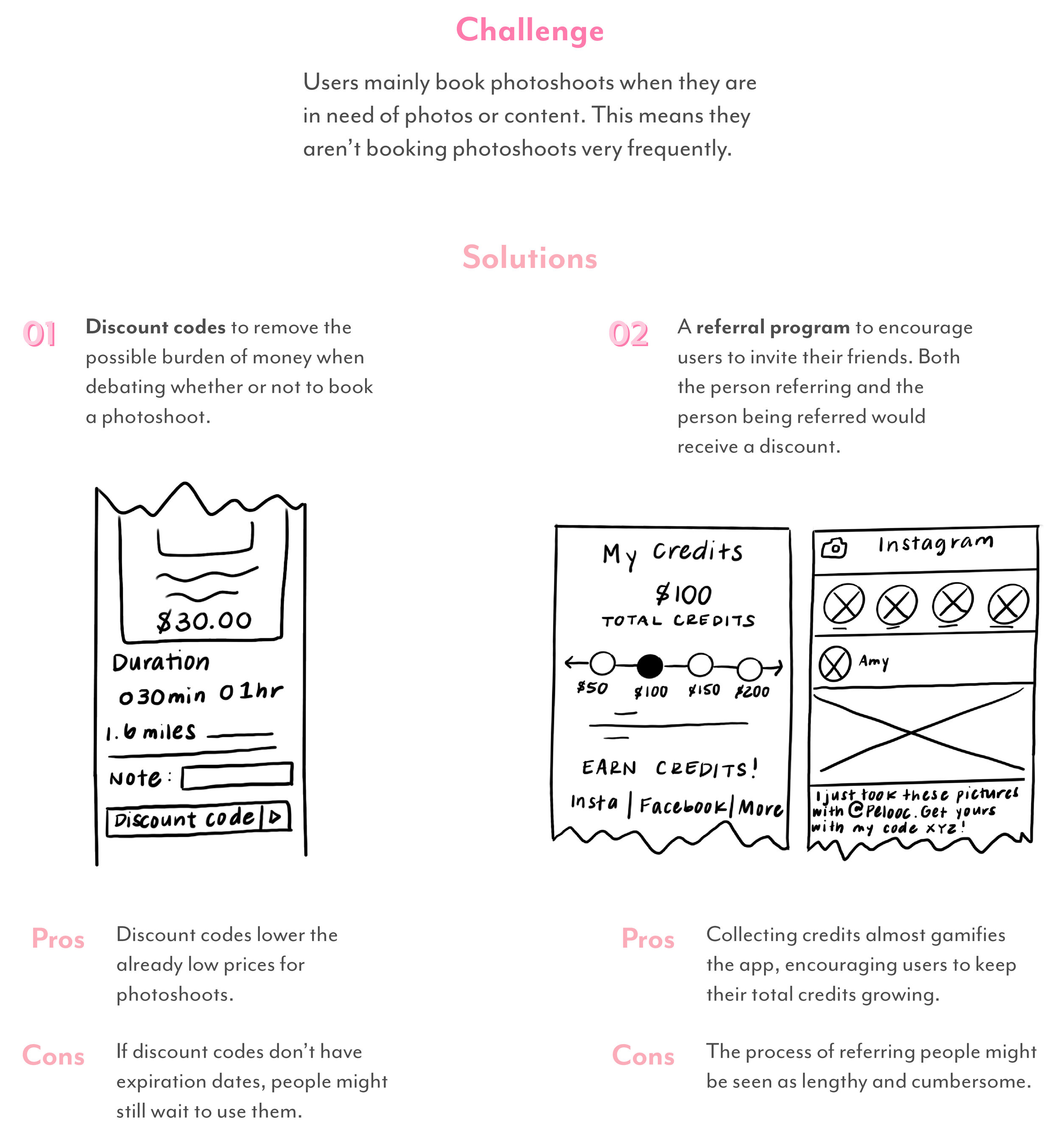
Incentivizing users to keep booking
Pelooc’s main revenue comes from users booking photoshoots; however, most people use Pelooc’s services only when they are in need of content or when they are in a location where they don’t have someone to take their photo. How can we incentivize users to keep booking photoshoots, even when they aren’t in these situations? As you can see below, I listed out two solutions, along with their pros and cons, to this challenge.
Creating a messaging hub
Right now, users can only message each other when they are both involved in the same booking (i.e. the phototaker and the photolover). Because of a smaller budget, my team and I held off on designing a messaging hub; however, creating one in the future would allow phototakers and photolovers to chat with each other and figure out if they are a good match for a photoshoot before even setting up a booking. Because of how efficient it is, I’d take inspiration from Instagram’s messaging hub.
Expanding Pelooc’s services
Pelooc was created as a solution for people who don’t have someone to take their photos. Once Pelooc has gained a loyal user-base, it would be interesting to include videos among Pelooc’s service. Because content creators are one of Pelooc’s target users, on-demand videographers would likely be as popular as phototakers. To do so, I would create a separate sign-up process for users who would like to sign up as a videographer. I would also include videography options in the booking process.

